How we designed our market-leading, digital driver’s place


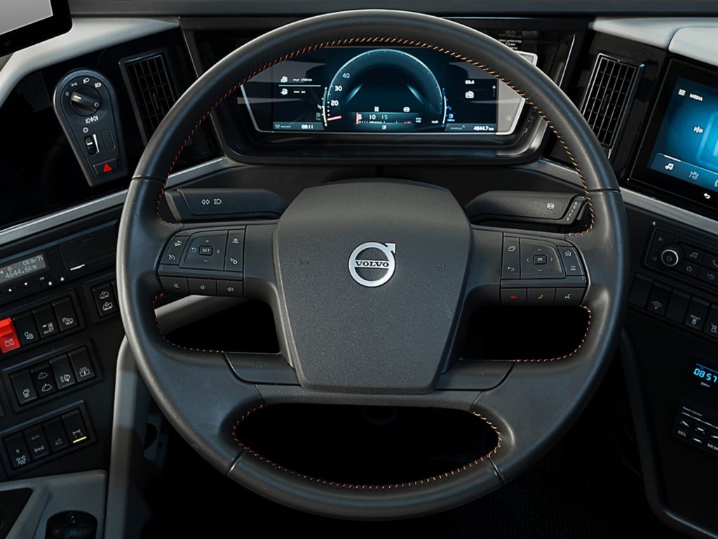
The driver’s workspace featuring a fully digitalised instrument cluster, navigated entirely from controls on the steering wheel forms part of the design.
“The challenge was to create a cohesive design that not only encompasses the new digital functionality, but has the same trusted, familiar Volvo look and feel,” says Dan Frykholm, Head of Design. “Ultimately, we wanted the driver to have an intuitive experience and feel comfortable and at home in the new digitised environment.”
Human Machine Interface (HMI) and its role
For Volvo Buses UX Designer, Philip Gates, this meant working in close collaboration with talented HMI engineers at Volvo. They develop the software functions that process large volumes of data for the digital display. Philip’s job was to ensure the software the driver interacts with is intuitive and easy to understand.
He explains: “For the digital display, we needed to evaluate exactly what the driver should see in order to do their job safely and comfortably. To do this, we have to follow certain industry conventions and be consistent, but we also have to avoid unnecessary and complex information to create a logical and seamless experience.”
Creating the best driver experience
Drivers and customers from different markets were also involved from the very start of the design process. One of the early steps was to conduct user studies to find pain points and solve them. By testing, refining, and testing again, the design team were able to develop the best solutions.
Philip Gates says: “It is often tiny design changes that are hardly noticeable, but together they contribute to a better, more user-friendly experience. What’s great about UX design is that it’s alive and continues to evolve. Development doesn’t end because you introduce it – there will always be room for improvement.”
“This process requires devotion and is all part of designing the optimum user experience,” says Dan Frykholm. “To be a designer you need a great deal of empathy, and you cannot assume all drivers are the same. You need to get into their mindset to ensure the design is inclusive, relevant and meaningful. It is also about making the functions a pleasure to use. If you can do that, I believe you can even create a better and safer driver.”
Digital instrument cluster
One of the first fully digital instrument displays available on the coach market, the main cluster has been designed alongside HMI engineers to ensure a focused, intuitive display. It offers two contrasting views to suit driver preference – Analogue for a more traditional feel, and Focus, a pared down screen for minimal distraction. All the functions within the cluster are operated safely from the new steering wheel controls.
Steering wheel controls
New controls are positioned on the left and right side of the steering wheel for safer, easier access. Intuitive Volvo icons and shortcuts create familiarity, and the driver can easily toggle between the different functions. The controls are fully integrated with the main instrument display.
Neck tilt function
A unique Volvo feature, the ergonomic neck tilt function allows the steering wheel to be moved in any direction to suit the driver’s individual preference and help relieve pressure on the neck and back.